Introduction to dashboards
Create dashboards to visualize and explore live or historical data in your Flowfinity database. Quickly identify trends and exceptions, drill-down into datasets for more detail, and launch views or operations directly from your dashboards. Flowfinity dashboards provide operational intelligence to help you manage your business in real-time.
➤ You can see it in action here.
Example
A service manager needs to track work orders by field technicians, and effectively manage job costs. Throughout the day, the manager views a real-time dashboard for an overview of activities as they happen. The dashboard sums up the total time spent on work orders and their total estimated costs, and breaks down the results across regions.
Instructions
-
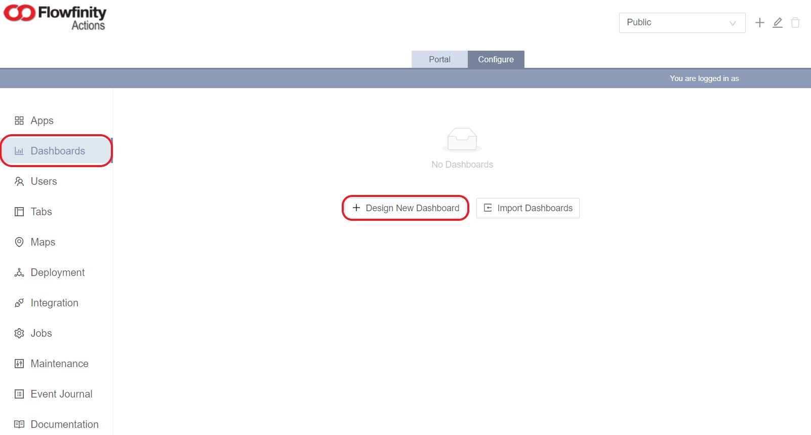
Click on the Configure tab.
Note: If you are using Flowfinity Actions Enterprise Edition, select the appropriate "Site" from the top right drop-down menu -
Under the Dashboards section, click the 'Design New Dashboard' link at the bottom of the page
-
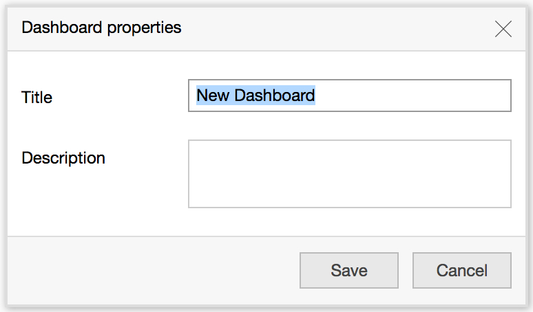
Enter the dashboard name, description, then click 'Save'
-
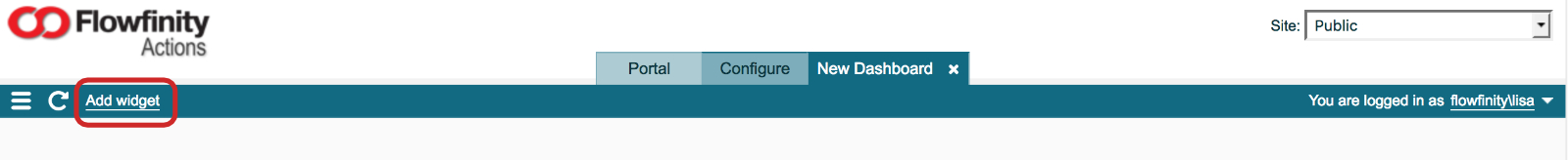
Next, click 'Add Widget' at the top left of the page. Dashboards are comprised of widgets, which display the live data you will interact with
- Select the "Source app", which will be an application already built in Flowfinity (e.g. Work Orders)
- Next, choose the View where the data is coming from (e.g. View All Records).
-
Choose a Dimension to indicate how the data should be aggregated, or grouped (e.g. Region).
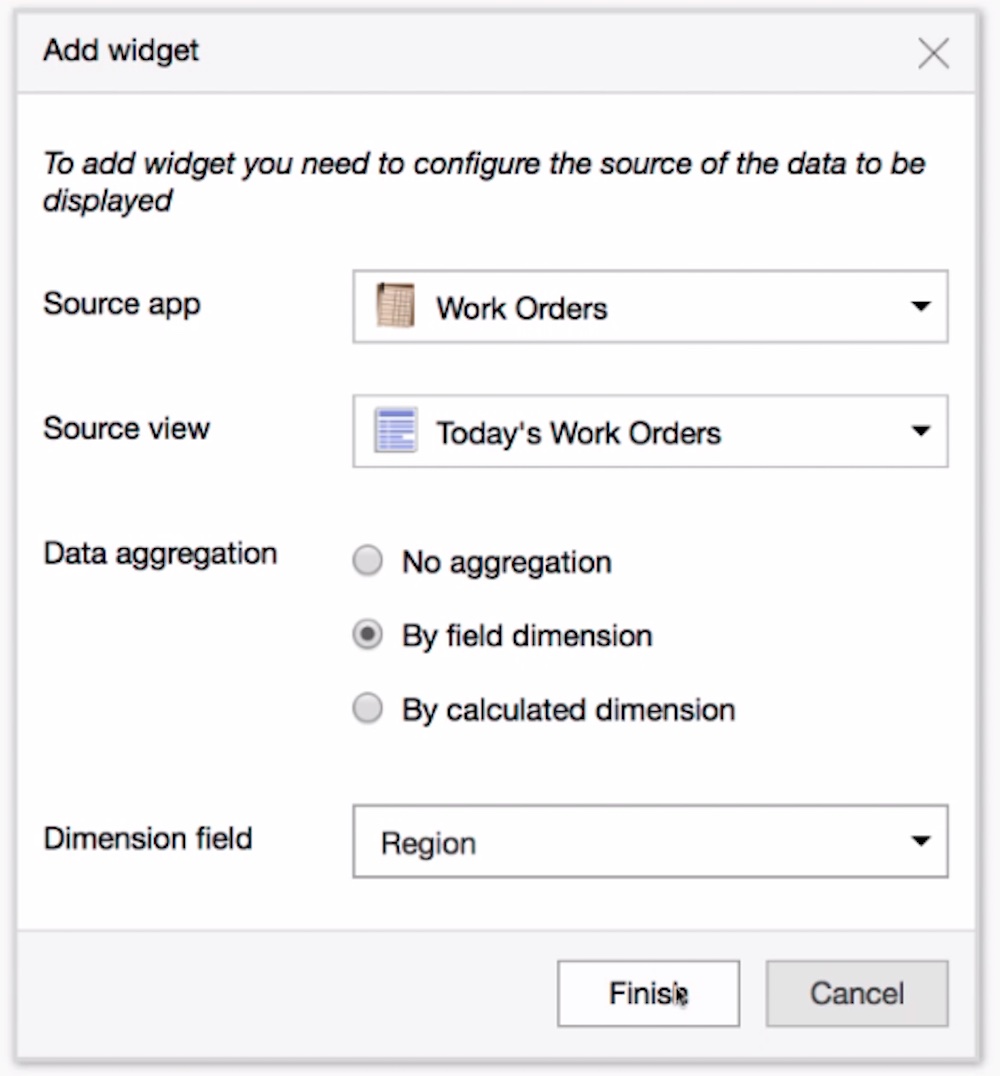
- Click 'Finish'
-
To select data that will be graphed in the dashboard, add measures. There are three types of measures available:
- Count measures that count records
- Field measures that use a single field to perform calculations based on existing data, such as summing up numerical fields
- Calculated measures that use multiple fields to create a new column of data that did not exist in the original dataset- Right-click anywhere in the chart, and select 'Add count measure' to sum up the number of items in the category (e.g. for this widget, it will count the total number of work orders per region). Click 'Save'
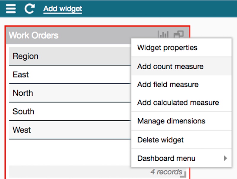
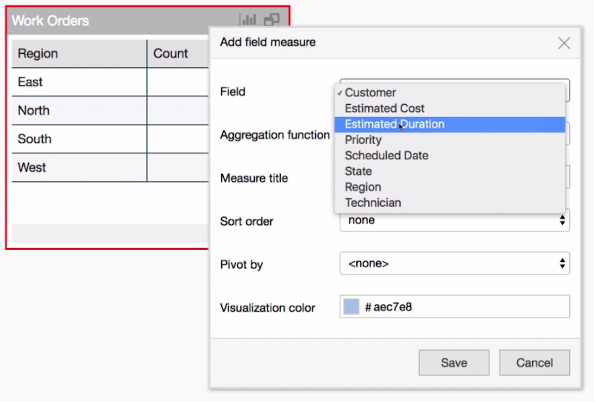
- To add another measure, right-click anywhere in the chart again, and select 'Add field measure.'
-
Choose the field with the data you want to sum up (e.g. Estimated Duration), and the proper 'Value format' (e.g. Timespan). Click 'Save'
-
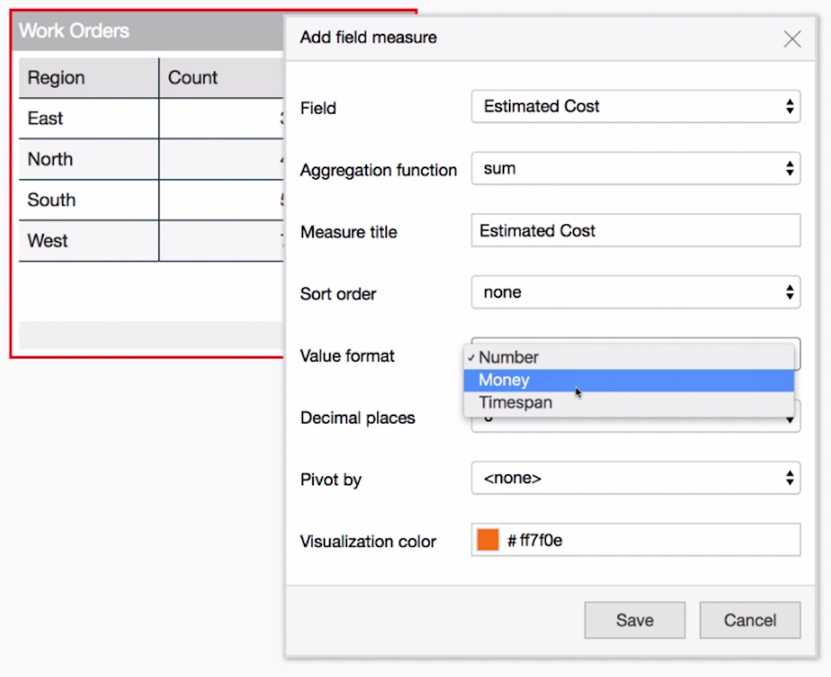
To add more measures, repeat steps 9b and 9c with new fields and corresponding value formats (E.g. Estimated Cost, Money)
- Right-click anywhere in the chart, and select 'Add count measure' to sum up the number of items in the category (e.g. for this widget, it will count the total number of work orders per region). Click 'Save'
-
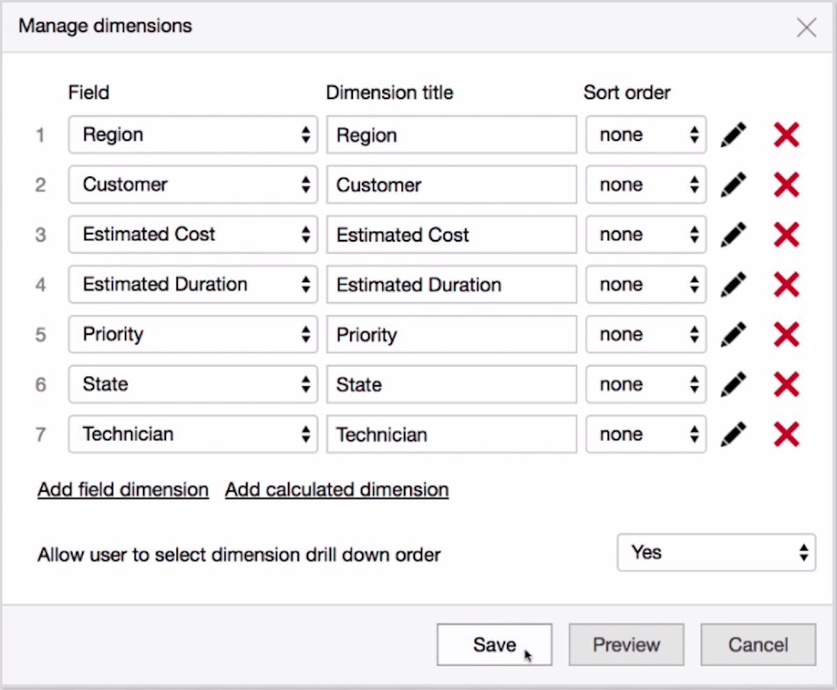
For additional drill-down options, right-click on the chart, and select 'Manage Dimensions'. Add as many dimensions as you'd like, as this gives you the ability to filter your dashboards into specific data sets once the graphs are created. Click 'Save'
-
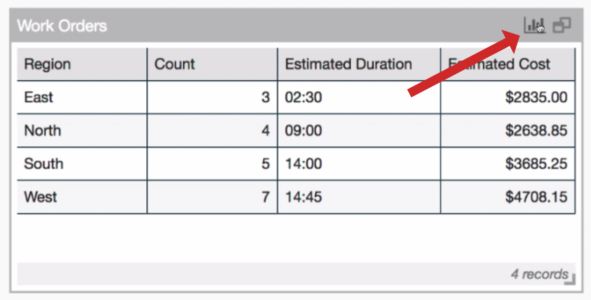
Your table data is ready! To see how the data looks as a chart, click on the chart icon in the top-right corner
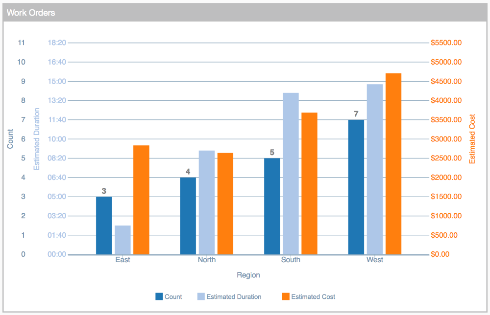
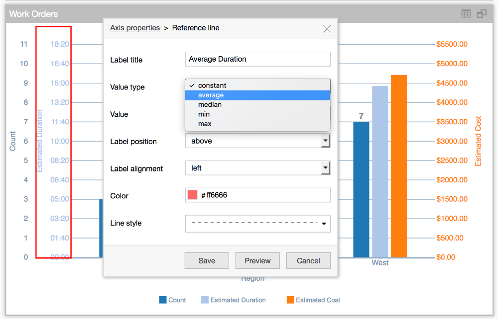
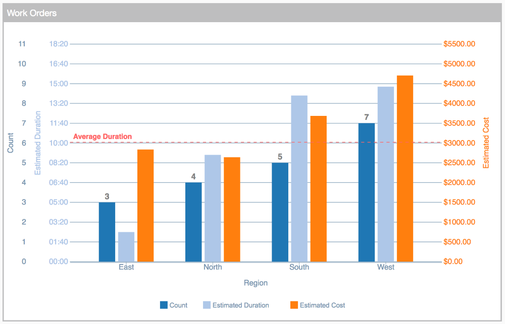
- Reference lines can help you quickly visualize any KPI, such as a weekly target or average cost. To add a reference line, right-click on the axis you want to edit (e.g. Estimated Duration), choose 'Axis properties', and click 'Add reference line'.
-
Enter the name (e.g. Average Duration), and choose the value type (e.g. average). Click 'Save'
-
To change the chart type, right-click on the column you want to edit (e.g. Count), and choose 'Edit visualization'
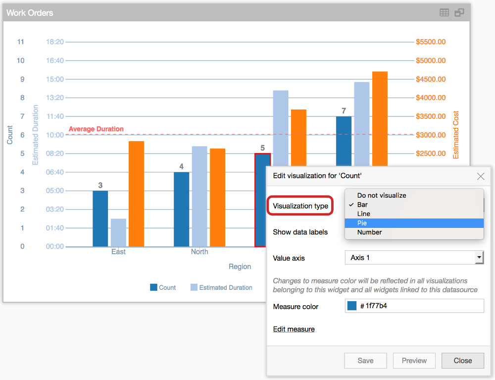
- Beside Visualization type, select your choice from the drop-down list, e.g. Pie. Click 'Save'. This will automatically create a new Level in the dashboard, because the visualization type (Pie) is different from the others that are displayed in Bar format.
-
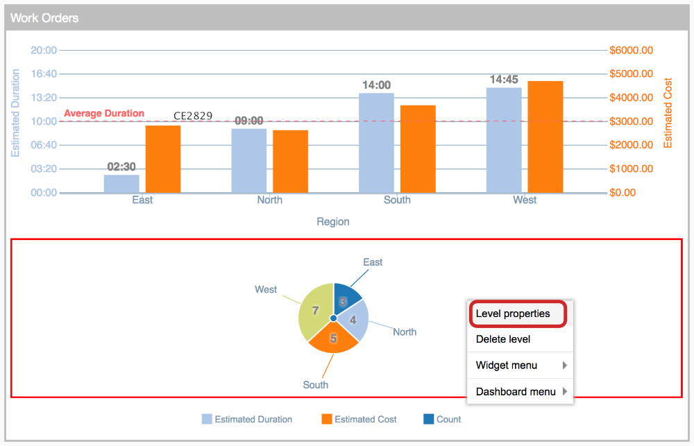
Right-click in the gray area around the pie chart, and select 'Level properties'
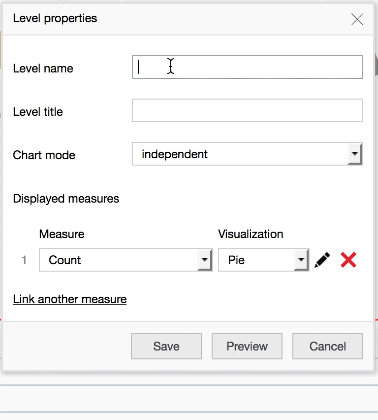
- Specify a level name (e.g. Pie & Numbers)
- At the bottom of the window, click on 'Link another measure' and select the field you want to sum up from the drop-down list (e.g. Estimated Duration)
- Right beside it, select how you want the data displayed (e.g. Number). Click 'Save'
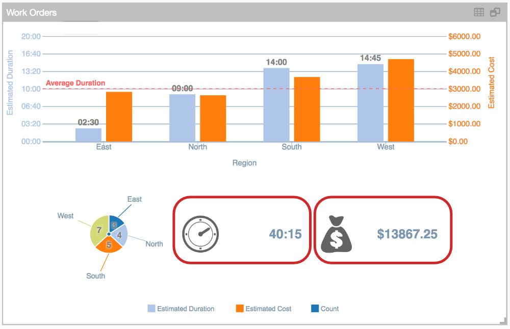
- Repeat steps 16 & 17 with additional fields you want to display (e.g. Estimated Cost)
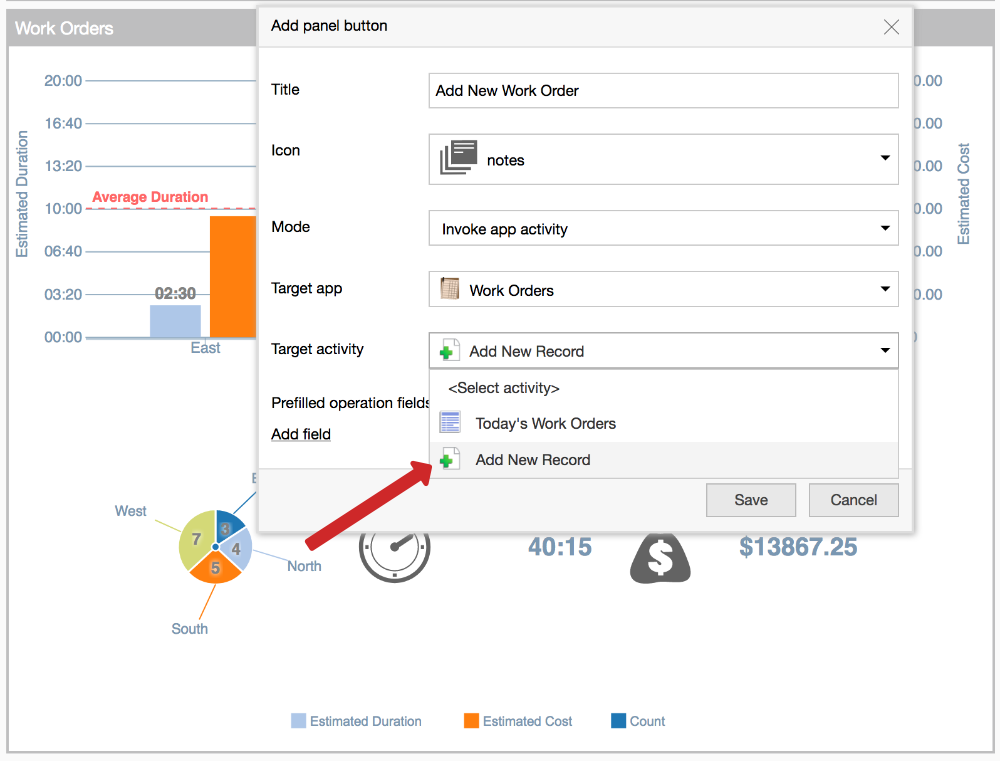
- You can also create custom buttons that link to business activities, or launch external links. To add one, right-click anywhere in the white space of the dashboard and choose "Widget menu". Click 'Add panel button'
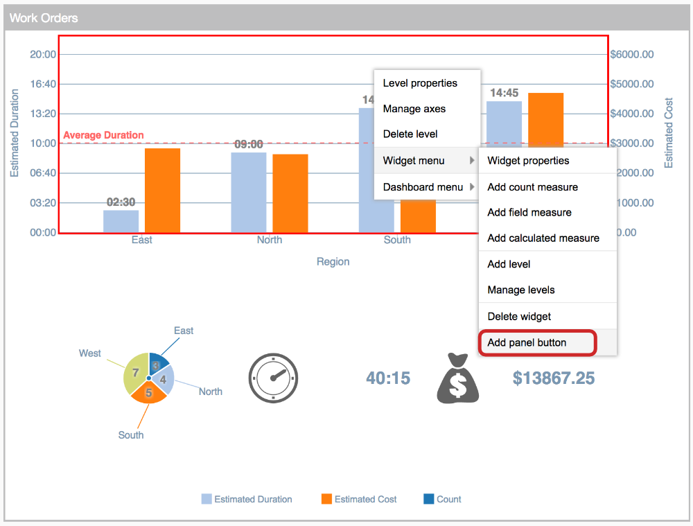
- Name the button (e.g. Add New Work Order) and select the activity type under 'Mode' (e.g. Invoke app activity)
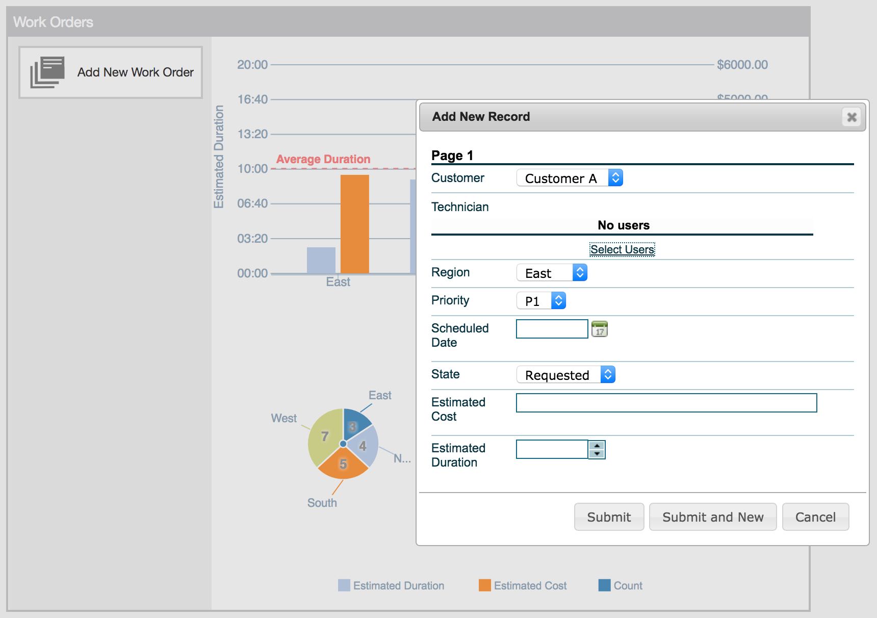
- Under 'Target App', choose the app where the operation is from (e.g. Work Orders), and then select the activity (e.g. Add New Record). Click 'Save'
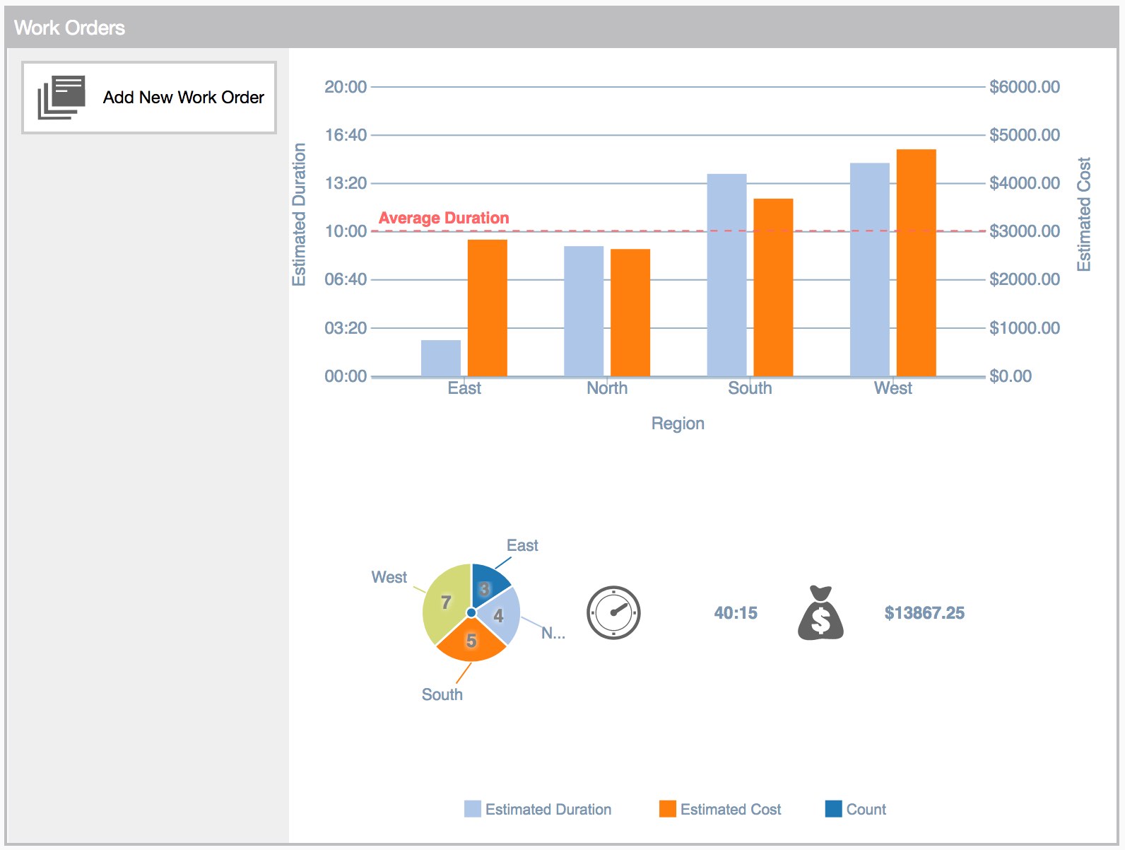
- The new button will now appear in the top-left corner, and can be customized for color and placement around the dashboard.
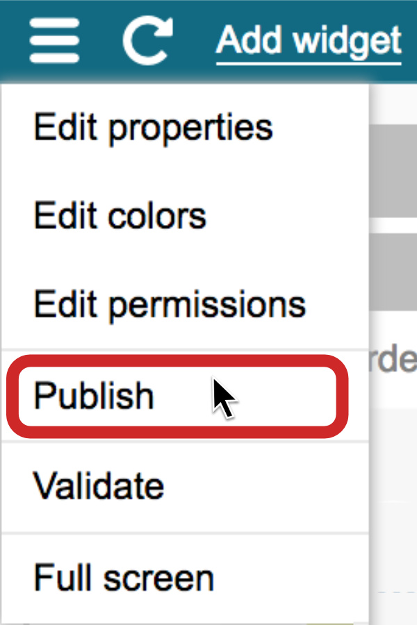
- Click the menu icon in the top-left corner, and publish the dashboard


You can continue to edit the dashboard until you have all of your data and visualizations set up. Request a demo to learn more.