Dashboards Demystified: Deliver Better Business Insights with Data Visualization
June 02, 2020, by Sean King
Background
Are you taking full advantage of dashboarding capabilities to drive business intelligence? Increasingly business leaders are demanding simple data visualizations to provide real-time insight into operations and assist in daily decision making. This article will provide some insight into the dashboarding capabilities that you can set up quickly without code using the Flowfinity platform.
What are dashboards?
To put it simply, dashboards are tools for visualizing business data to make better-informed decisions faster.
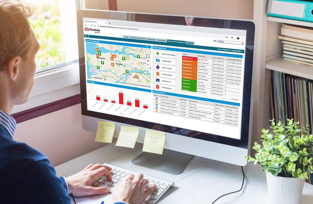
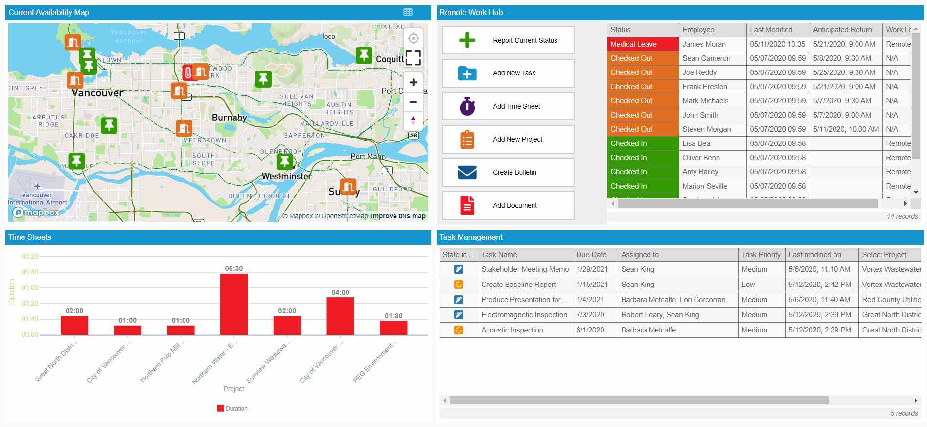
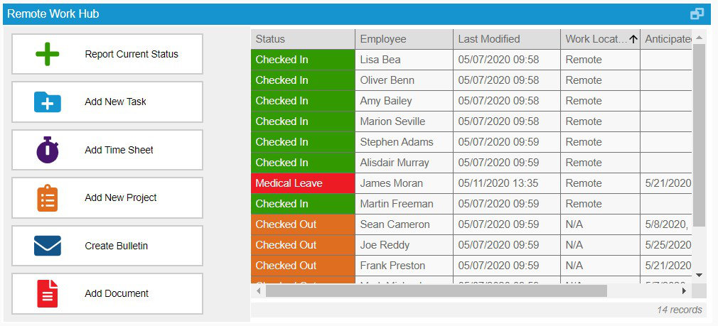
In Flowfinity, dashboards are interactive collections of ‘widgets’ that display application data in real-time in tables, charts, and maps. These widgets act as the building blocks for your dashboard, and when taken together provide a complete view of your operational key performance indicators (KPIs). What makes interactive dashboards even more powerful is the ability to act on information instantly by launching operations and interventions directly from your custom widgets.
Why are dashboards important?
Data visualization is a powerful tool for managers, and it takes on an extra level of importance when leading remote teams. Leveraging interactive dashboards can have significant benefits when working remotely, including helping you identify opportunities and efficiencies to maintain alignment and motivation throughout your organization when physically distant from core operations.
Key benefits of interactive dashboards include:
- View operational data in real-time and on any device
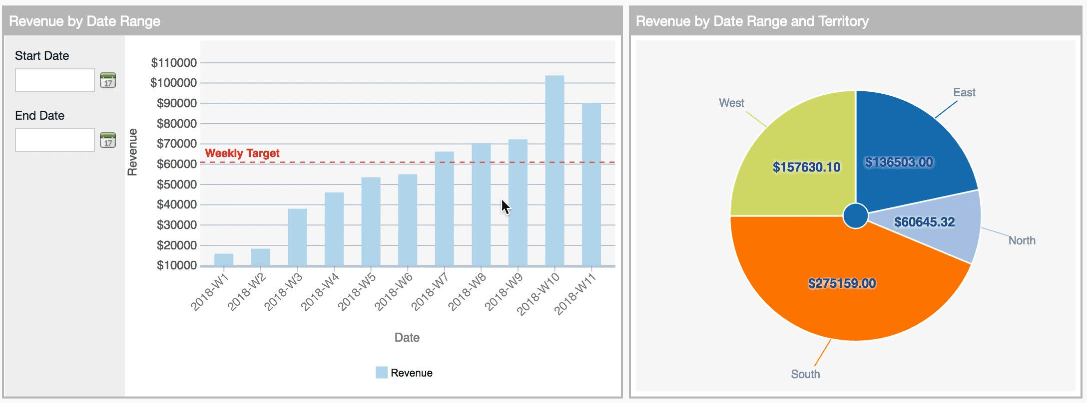
- Visualize important business data with intuitive charts and graphs
- Create, delegate, and approve tasks directly from your dashboard hub
- Communicate with a remote workforce to ensure accountability and alignment
- Iterate and amend your no-code dashboards quickly as your workflows evolve
- Design custom dashboards for different business-units and departments to streamline your reporting process
Where to get started?
This first step is to visit our Knowledge Base for self-serve directions to help you create a dashboard and then add one or more widgets. But it’s also important to remember that dashboards visualize data that you already have stored in your applications. As a result, well-conceived dashboards can act as a flexible hub drawing together KPIs and data points that help reflect the needs of entire enterprises or even specific departments.
How do I get the most out of dashboards? 3 takeaways for success
1. Understand the big picture and uncover the details all in one place
Create drill-downs in dashboards so users can easily examine underlying app data with a click.
For example, a manager overseeing a large department of remote salespeople may need their dashboard to display KPIs for the entire department at a glance.
Using drill-downs, the manager can quickly examine performance at the team and then individual levels without ever leaving the dashboard. This functionality allows you to see the high-level snapshots you need while making it easy to drill down into the data for greater granularity and uncover root causes to performance issues.
2. Act instantly to turn operational insights into action
Flowfinity dashboards are highly interactive. This allows you to launch record operations to edit information, update a status or assign tasks, and dispatch work orders directly from your dashboard widgets.
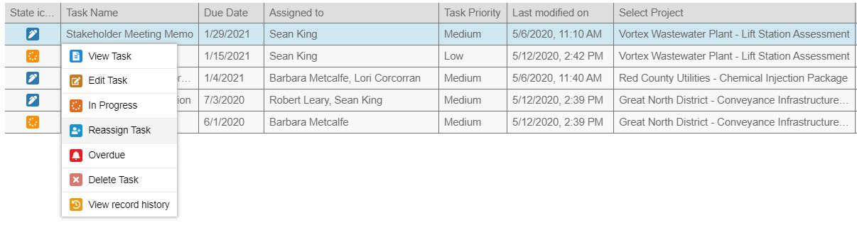
To make your dashboards even more interactive and user-friendly, add buttons to your dashboards. Buttons help end-users add and edit new records to apps directly from widgets adding efficiency to your workflows and improving the experience on mobile devices.
3. Accelerate efficiency by connecting your structured application data to maps
Most business data contains a geographic element, whether it’s the location of employees, assets, customers, or locations such as work sites. Mapping allows you to see how your physical assets are being deployed in a custom map widget, placing your operational data in its geographic context to make your dashboards even more visually intuitive and improve decision making.
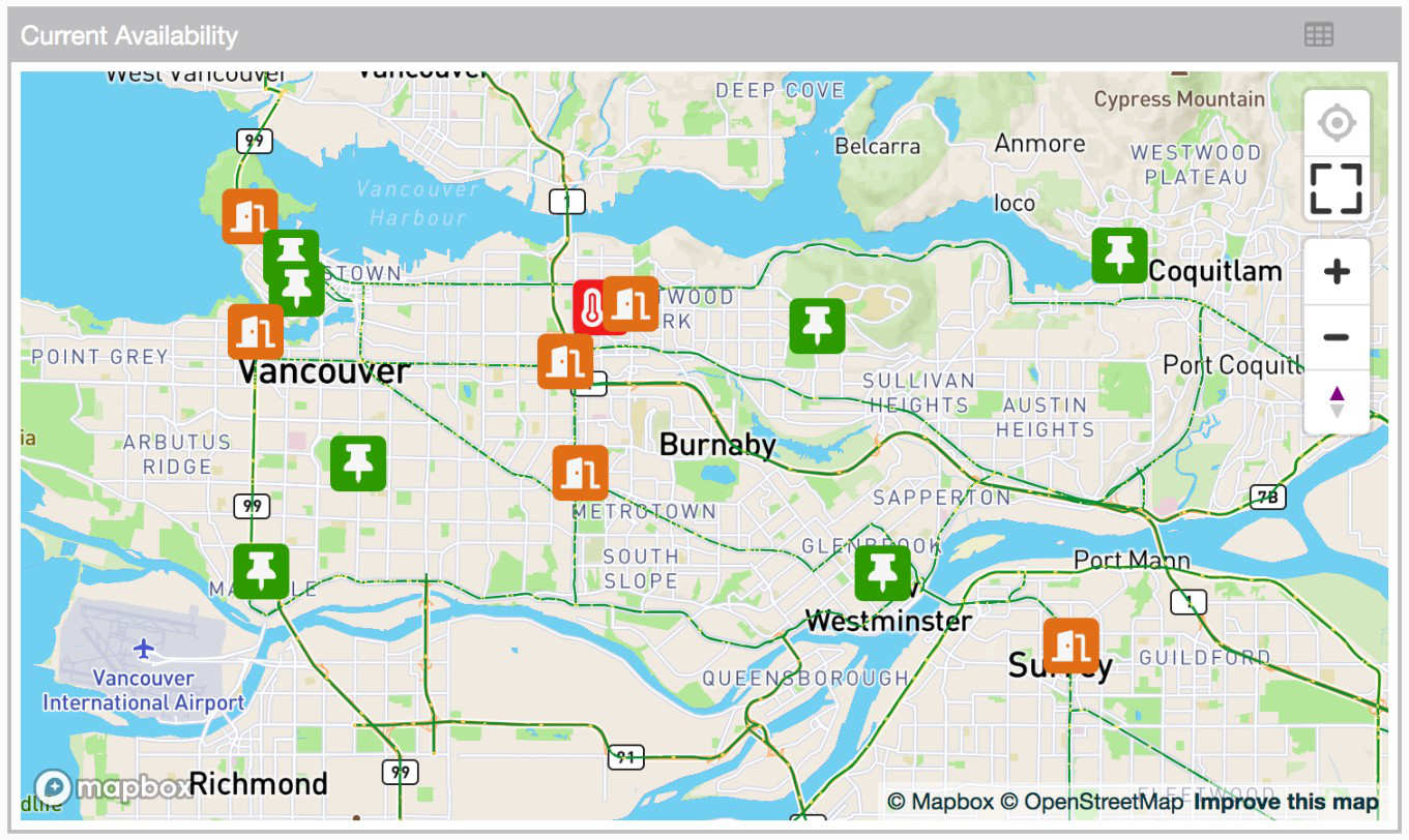
As with any other Flowfinity dashboard widget, you can launch operations and perform data drill-downs with a click.
For our customers that rely on large amounts of field data, such as environmental or utility professionals, dashboard widgets also allow for users to follow their location on a live map and to select inaccessible locations with on-device coordinate selection.
For more information about implementing dashboards in Flowfinity, please refer to our Knowledge Base or contact one of our experts.